UX — Information design for a better user experience
Nothing lasts forever, but occasionally we have a tendency to give up on tried-and-true solutions too soon. A recent essay on Medium advised against creating applications that respond to mouse hover with information or action. Although the mouse was not specifically addressed, I find it impossible to understand how the term “hover” could reasonably apply to touchscreen-based devices.
Hover is implemented in ArtisticGUI, the graphical software framework I created to enable my own desktop programs, with the aim of enhancing user experience with enriched information. You will be able to form your own opinion about how true the stated ideas are after reading this article.
Hover is used by ArtisticGUI for two different purposes:
- Let the user know that a tool is being hovered over so they can click it to ask the application to do something.
- Through a redesigned implementation of an old user interface element, the tooltip, to provide information about the tool’s functionality.
Since ArtisticGUI is a software framework, the aforementioned principles are fundamental elements of an information strategy rather than merely guidelines. After looking at a few real-world instances, it will be easier to understand what that means.
Informing users that they can do something
ArtisticGUI is a graphical software framework, with the term graphical indicating that it favors the use of graphical elements such as icons above text. As a result, the user interface is divided into two types of graphical elements: those that represent actionable items and those that are not.
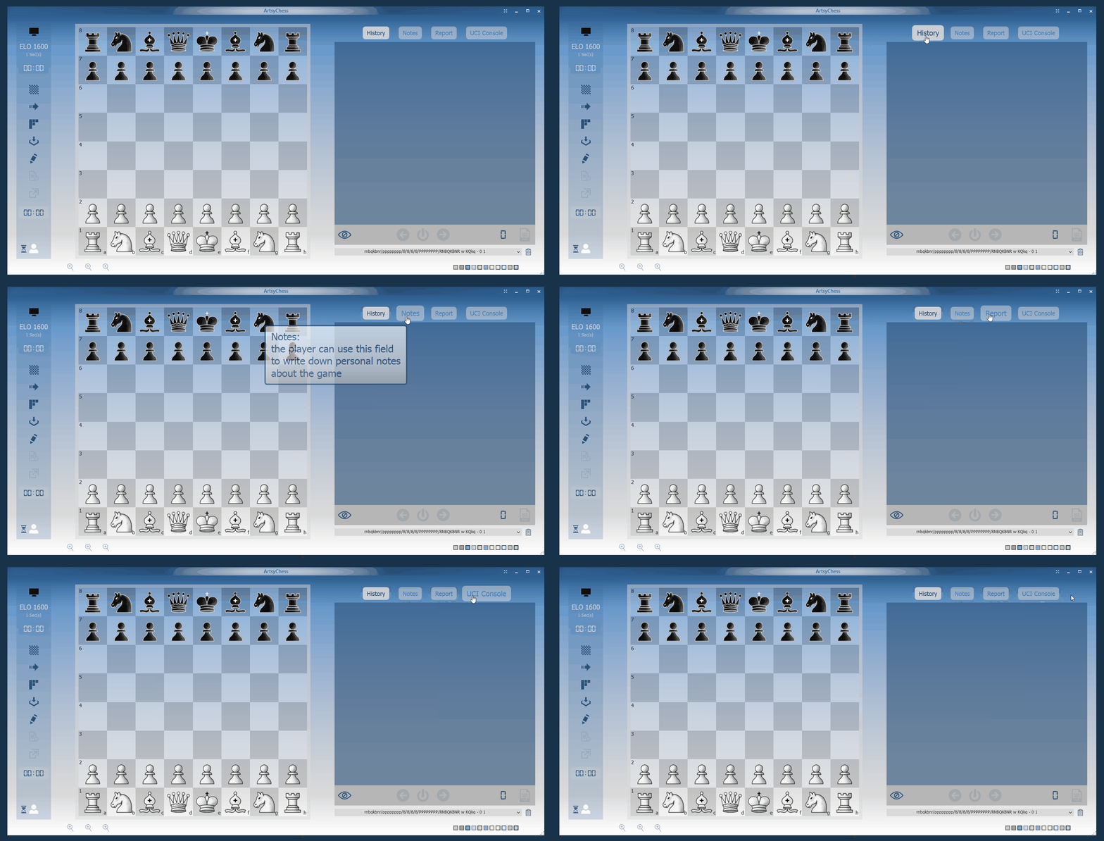
When the mouse is hovering over an actionable item, ArtisticGUI notifies the user that clicking will initiate an action. It accomplishes this by animating the graphical element and changing the mouse cursor, as shown below:

The behavior depicted above is the default when designing applications with ArtisticGUI, though the framework does allow the designer to disable both animations and the use of a cursor defined by the context if desired. As a user of those applications and an aging man, I appreciate having a visual reminder that a click may change the state of the application, but I respect any other opinion. De gustibus non est disputandum.
A more sophisticated feature
A tooltip is an information box that appears when the mouse is lingering over a certain spot of the application.
Misapplied tooltips can be as irritating as any other misused feature. However, when implemented correctly, tooltips can considerably reduce an application’s learning curve.
I had three types of users in mind when I created the information architecture for ArtisticGUI:
- The new user, who just started using the application.
- The casual user, who is familiar with the application but does not use it very frequently.
- The experienced user, who has in-depth knowledge of how the application works.
ArtisticGUI allows you to configure applications so that information is delivered to each category based on their specific needs.
Depending on how the application is configured, tooltips may behave differently.
- Experts may not require any additional information. Tooltips will not appear in their case.
- Casual users may require reminders from time to time. In their case, tooltips can appear only if the mouse is hovering over the same spot for a longer period of time than usual.
- New users may require information more frequently and may benefit from being given more information about what they need to know. In their case, tooltips can remain until the cursor moves away from the area of interest, and the information provided can be much more detailed.
ArtisticGUI includes configuration options that allow the user to fine-tune the underlying information system based on their current application knowledge.
Some concrete examples

As you might expect, the experienced user may prefer not to see any of the tooltips. In the preceding example, the tab items are still enlarged while hovering over them, and the mouse cursor changes to a hand to indicate that they can be clicked, but no tooltip appears.

One-liner tooltips, as shown in the example above, may be useful for reminding a casual user of a tool’s functionality. The one-liners above are classics in Windows applications, with the exception that they are unusually large. I will go into more detail about their dimensions later in this article.

A one-liner tooltip may not be sufficient for a novice user learning how to use the application. There may be good documentation somewhere, but why not have it available right away in the application? ArtisticGUI supports verbose tooltips with a variety of informative content to assist in flattening the application’s learning curve. To allow for complete reading, verbose tooltips remain visible until the user moves the mouse away from the tool.
Considering accessibility
The text in the tooltips in the preceding examples is much larger than the text in the tooltips visible throughout the system. ArtisticGUI has three different tooltip styles: normal, large, and extra-large, and I configured the application with the third option before recording the examples above, thus the very large tooltips.
When I defined those tooltip styles, the first thing that came to mind was accessibility rather than demos. Younger readers may not be aware of presbyopia, but those my age and older will understand why an information strategy that allows for larger text throughout the application may have a significant impact on its accessibility.
Conclusion
In software, there are no silver bullets. Depending on how it is used, the same technology can provide a very different user experience. I hope this article helped you understand what UX design entails when moving from abstraction to concrete cases.
All for now.